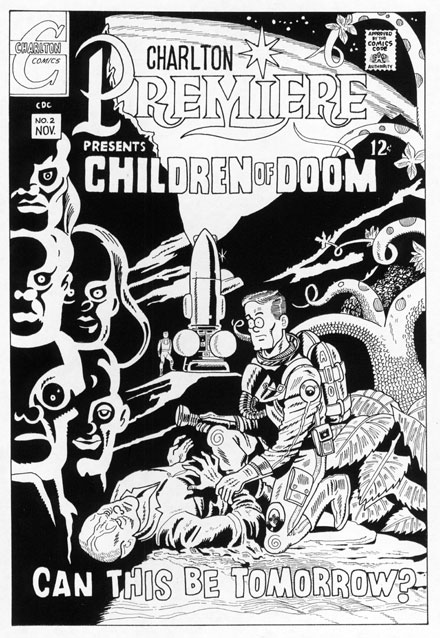
 CHARLTON PREMIERE #2 November 1967 Pat Boyette original artist |
|
 |
As legend has it, "Children of Doom"
was cobbled together virtually overnight
by Denny O'Neil (writing under his
"Sergius
O'Shaugnessey" alias) and artist
Pat
Boyette when editor Dick Giordano found
that
the material previously prepared for
the
second issue of the Showcase-like tryout
title, CHARLTON PREMIERE, was suddenly
unavailable
due to legal complications. |
| Nevertheless, this bleak look into the future
from the vantage point of 1967 rightfully
proclaims itself "A Charlton Classic"
right there on the splash page, as much for
its' experimental mixture of black and white
panels with full color art as for its' thoughtfully
crafted meditation on mankind's ultimate
destruction. To quote the jargon of the day,
"Heavy, man..." I can't help but have fond memories AND high regard for that book,as I do, in fact, have for the ENTIRE Giordano Charlton era of the late sixties. Imagine my DELIGHT, then, when Jon Cooke decided to devote an issue (and then a second) of his fine publication, COMIC BOOK ARTIST, several years back to that little company from Derby, Connecticut, the aforementioned Charlton!! Only--WHAT to draw? WHAT feature would I zoom in on for my regularly scheduled cartoon commentary? So difficult to choose--UNTIL I happened on the notion to assemble a massive montage spotlighting as many cherished Charlton characters as possible. Happily, I got out ALL my old Charltons, and pencilled each beloved old friend into my checkerboard layout, until the time came when, in need of a visual reference for "Children of Doom"s Spock-eared mutant. my copy of CHARLTON PREMIERE#2 lay there upon my drawing board. And THAT'S when, for the very FIRST time, and after ALL these years, I saw IT. Right there, smack dab in the middle of that now-classic cover. The space ship. Oh yeah, sure, I'd seen it BEFORE, but finally--FINALLY--I was seeing it for what it TRULY was. Go ahead. Take a look. I assure you, that while I may've grafted some of my stylistic nuances--i.e. squiggles--onto the figures in the reinterpretation, I've, er, REPRODUDED Boyette's rocket EXACTLY as he drew it. Check the original if you have any doubts. And WHAT exactly, may I ask you, does the space ship in question look like to YOU?... Uh huh--I thought so, too... Of course, you're thinking, by their very nature, rocket ships are going to bring, uh, FREUDIAN ASSOCIATIONS to mind, and I'll grant you that point. But tell me this--how many space crafts have YOU seen drawn in this manner, with two round spheres at it's base, hmm? Yeah, it was a FIRST for me. too... So there you have it. One of the MOST sober and distinguished entries in the ENTIRE Charlton Comics canon--and I've just proven it to be a cheeky precursor to that infamous Austin Powers bit! YOU know the one. The one with the, well, you know?... My HUMBLEST apologies to the folks involved in creating this issue--which I STILL found to be a powerful work upon a recent rereading--for pointing out to one and all that there's a mustache (or SOMETHING...) on the Mona Lisa! I restrained myself from spoiling the mood over in the pages of COMIC BOOK ARTIST, but, well, I could only keep quiet for so long, y'know?... ...and ESPECIALLY not since wife Lynn got into the habit of asking me if that was a Pat Boyette spacecraft in my pocket, or was I just plain HAPPY to see her?... Heh... | |