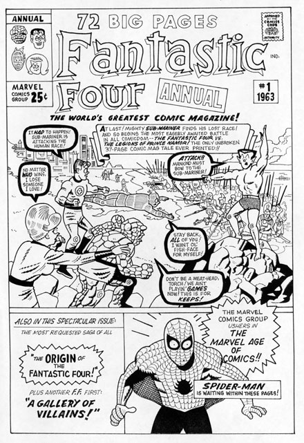
 FANTASTIC FOUR ANNUAL #1 1963 Alternate cover Jack Kirby and Dick Ayers original artists |
|
 |
Y'know, I never thought the day would come when I'd find myself paraphrasing seventies sweet-soul sensation, Lionel Richie, but regarding the following sequence of redos, what ELSE could I possibly say by way of introduction but, "One, two, three times a cover"?... |
| After a mere 16 issues, the fledgling Marvel
Comics Group clearly knew they were on to
something with their flagship title, and
so issued their first FANTASTIC FOUR giant-sized
edition during the summer of 1963. At the
time, it was quite the spectacular event
for a ten year old comics fan like myself,
but apparently, this landmark in publishing
history was not without it's own set of tribulations.
What you see over to the side there--and
again above, in my own slightly off-kilter
reinterpretation--is what appears to be Jack
Kirby's first, ultimately rejected cover
illustration for FF ANNUAL #1. Of course, even we most stalwart of Marvelites weren't aware of the existence of this rare piece of art until a small, almost postage stamp-sized line art repro of it was unceremoniously slipped into an early issue of the Official Marvel Fan Club magazine, FOOM, back in the seventies. It was quite the stunning revelation, lemme tell ya--the Dead Sea Scrolls ain't got nothing on unseen Kirby art circa 1963!?! And then later, in the mid-eighties, when the company published a series of Official Indexes spotlighting their two most popular titles, the entire endeavor was well justified in my mind if only for the opportunity to view full-sized, richly colored, slick paper versions of this and three other lost vintage rejects printed on the back covers of said indexes. Steve Ditko's original takes on AMAZING FANTASY #15 and AMAZING SPIDER-MAN #10 made their glossy debuts in addition to Kirby's alternate for FF #3, with the one featured here today filling out the quartet. In fact, several years ago, I took a shot at redoing all four of 'em for a "Dateline:@#$&!" strip that would eventually turn up in COMICS BUYERS GUIDE, and a portion of that is what we're looking at here. (And yes, sooner or later, the rest of 'em will no doubt turn up in these environs, but for now, let's just focus on The World's Greatest Rejected Comics Magazine Annual Cover, shall we?...) And just why do you suppose multi-tasking editor and art director Stan Lee gave the King's first attempt at presenting Prince Namor's eagerly awaited family reunion to the howling hordes of Marveldom Assembled the imperious thumbs down? Well, we'll never know for sure--I bet even if you asked Smilin' Stan, he'd surely have no idea, his memory being infamously poor--but that won't stop me from offering up a few of my own suppositions, worry not. First off, just who do you think deserved more cash for completing this co-opted cover--the penciller, the inker, or the letterer?!? My gosh, I've read entire issues of books scripted by Mike Grell that had less dialog than what Stan inflicted on poor Artie Simek for the cover of this twenty five cent bonanza!?! And here's another cogent query--when you take a quick peek at this pic, WHO exactly is it that jumps out at you? Is it the various and sundry members of the title wielding Fantastic Four, or perhaps their swim-suited antagonist, that Royal Pain in the Ocean, Sub-Mariner himself? Nope. The Fab Five are instead easily--and inappropriately--dwarfed by special guest star, Spider-Man, whose little-more-than-a-cameo appearance is a tad, shall we say, overexploited? Still, even then, it shows good instincts on Stan's part--the FF may've claimed "The World's Greatest Comic Magazine" for their own, but it was fairly obvious from even early on that Spidey would soon wind up being their Most Popular Character... The color scheme you see here was most likely concocted in 1986 and not at the time the art was originally completed. But the ill-defined group of Atlanteans gathered behind their new boss--same as the old boss--certainly doesn't lend clarity to the composition, regardless of which hues were added to their sloshing swarm. Plus, in this instance, the red Torch is practically lost in the muddled mixture. And no offense meant ladies, but anytime--at least, back in that simpler era--when the most prominent member of the FF was the Invisible Girl on your ostensibly exciting cover scene, you were in deep, DEEP trouble!... It's a given that all Jack Kirby covers from the earliest years of Marvel Comics are automatic classics, but not all of them are terrific drawings in and of themselves. Stan had his partner churning out so much material in those dizzying days, that some of it was bound to be of, well, a lesser quality. I wouldn't go so far as to say this rejected cover of the FF Annual necessarily fits into that category, but it is fairly undistinguished and certainly the published version improved on it's flaws in several ways. As we'll see, next... |
|