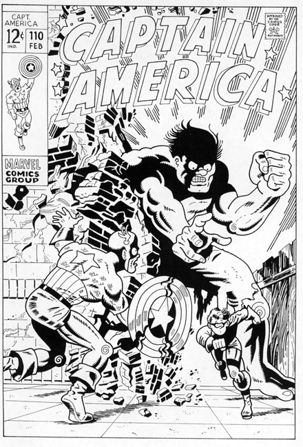
 CAPTAIN AMERICA #110 February 1969 Jim Steranko original artist |
|
 |
Captain America has always been my favorite character. When Marvel finally awarded the shield slinging Avenger his own title in 1968, I was overjoyed--and eventually, paranoid. What if I missed an issue? It's not like there were comic shops lurking around every corner back then, ready to supply me with any missing numbers in my collection (for a slight markup, of course). The only way to guarantee that I'd stay on top of Cap's exploits--not to mention the pulse pounding art provided by the greatest of them all, Jack Kirby--was to subscribe. |
| Not a big deal, you say? Ah, but it was.
In order to insure reliability, I had to
give up something in return, and that something
was perfection. More specifically, I knew
from past experience with subs to SPIDER-MAN,
FANTASTIC FOUR and DAREDEVIL that any comics
Marvel mailed to me would never be considered
"mint". They folded 'em in half,
y'see. Catering to the collector's market
was years in the future--in 1968, they were
just concerned about saving postage costs.
Although I always managed to maintain my
books in tip-top shape, I was willing to
make the trade off. And then, the first issue
of my CAPTAIN AMERICA subscription arrived,
number 110, and almost immediately, I regretted
my decision!... It was a cold wintry day when I arrived home from a rare visit to my dad's relatives in New Jersey and the first thing I did was head for that day's accumulated mail. Excited to find a telltale brown mailing wrapper amongst that day's bills, ads, and whatnot, I grabbed my prize and headed off to my room. Fully expecting to see a King Kirby Komposition adorning my latest four color treasure, I was instead shocked, surprised and astounded by what instead filled my gaze: Jim Steranko!! Or rather, a Jim Steranko drawing--an AMAZING Jim Steranko drawing!! And--and--it was FOLDED down the middle!?! My heart sank and soared simultaneously. On the one hand, here was the hottest, most experimental, trend setting young artist in the field having a go at the Sentinel of Liberty, but on the other, there was this nasty, offensive, ugly crease running right down the center of his magnificent illustration!?! I mean, just take a look at it--has there ever been a MORE incredible Hulk? Geez--Steranko and Cap, my two respective favorites--TOGETHER! And I had the crumpled up comic to prove it...(cue the sound of teeth gnashing...) Those of you schooled in your comics' history know all too well that the excitement didn't last very long. Three issues to be exact. The ever-enigmatic Steranko soon took his leave and moved on, but, boy oboy, he sure contributed a memorable trio of images to pulp paper posterity! It's been my extreme pleasure to have replicated all three down to even the smallest of details, with one notable omission--the crease lines may still make me grimace, but what's the point of making you folks suffer as well??.. |
|